
Ford.com vehicle showroom design
A flash-based vehicle showroom, designed in tandem with the Ford.com redesign, produced while under contract to Avenue A / Razorfish. These screens are shrunk down from 950x600; please contact me to see actual size images.

Initial screen.
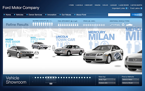
Dropdown panel with icons representing different criteria with which to filter the results. Users can filter based on fuel efficiency, seating capacity, and price.

Rollover indicator when users interact with the icons.
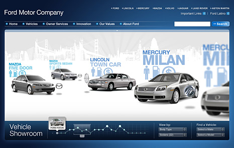
Rollover indicator on legend. Those cars which most closely match the users' criteria appear higher on the graph.
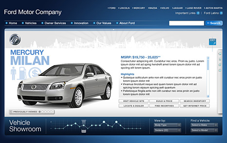
Detail view of an automobile, once selected.

View of side media panel, which includes other photos of the car, video, 360 degree view, and other rich media assets.
Initial concepts and sketches
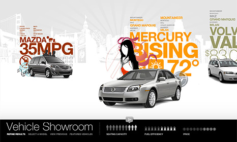
Initial environment sketch. Each car represents a body type. The cars within each body type are listed in text above the car. The relative size represents how cloesly matched the car is to the user's filters.

Initial sketch of how cars could be listed in text next to a car that would represent its body type. As users roll over the car names, the graphic would change.

Initial design for the vehicle showroom, closely resembling the original wireframe. From here I was encouraged to make the showroom more experiential, which is how the showroom evolved.

